The Montessori Academy of Chicago was established in 2005 in response to the lack of high-quality childcare and educational options in the West Loop. This high-end, state-of-the-art facility (complete with child-sized furniture and flatware) had everything a parent would ever want. Unfortunately, their brand ID didn’t match their facilities.
We were approached by their PR/marketing agency, Winger Marketing, to produce the new logo and later to develop a high-quality pocket folder and application forms.
Design Concept
The Montessori globe (and continent map) use a specific color palette for each continent. With thousands of Montessori schools in the U.S., including hundreds of programs in public and charter schools, these colors have relevance in Montessori circles. Fortunate for us, the globes also make perfect “Os” and we think Dr. Maria Montessori would be tickled South-American pink.
Next Up
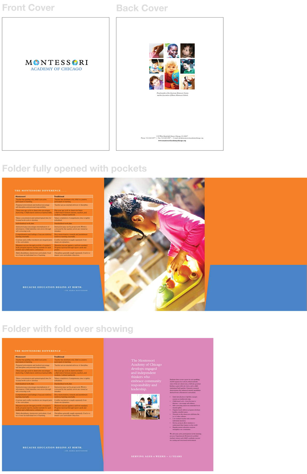
Next up was the pocket folder. We pulled out the orange, blue and pink from the logo and painted the sheet with bold saturated color. This 6-panel, 2-pocket folder also serves double-duty as a mini capabilities brochure with its integrated marketing copy.
Fortunately, the client opted for high-quality paper and custom finishing, so we were able to deliver a high-quality piece rather than cookie-cutter online schlock.


